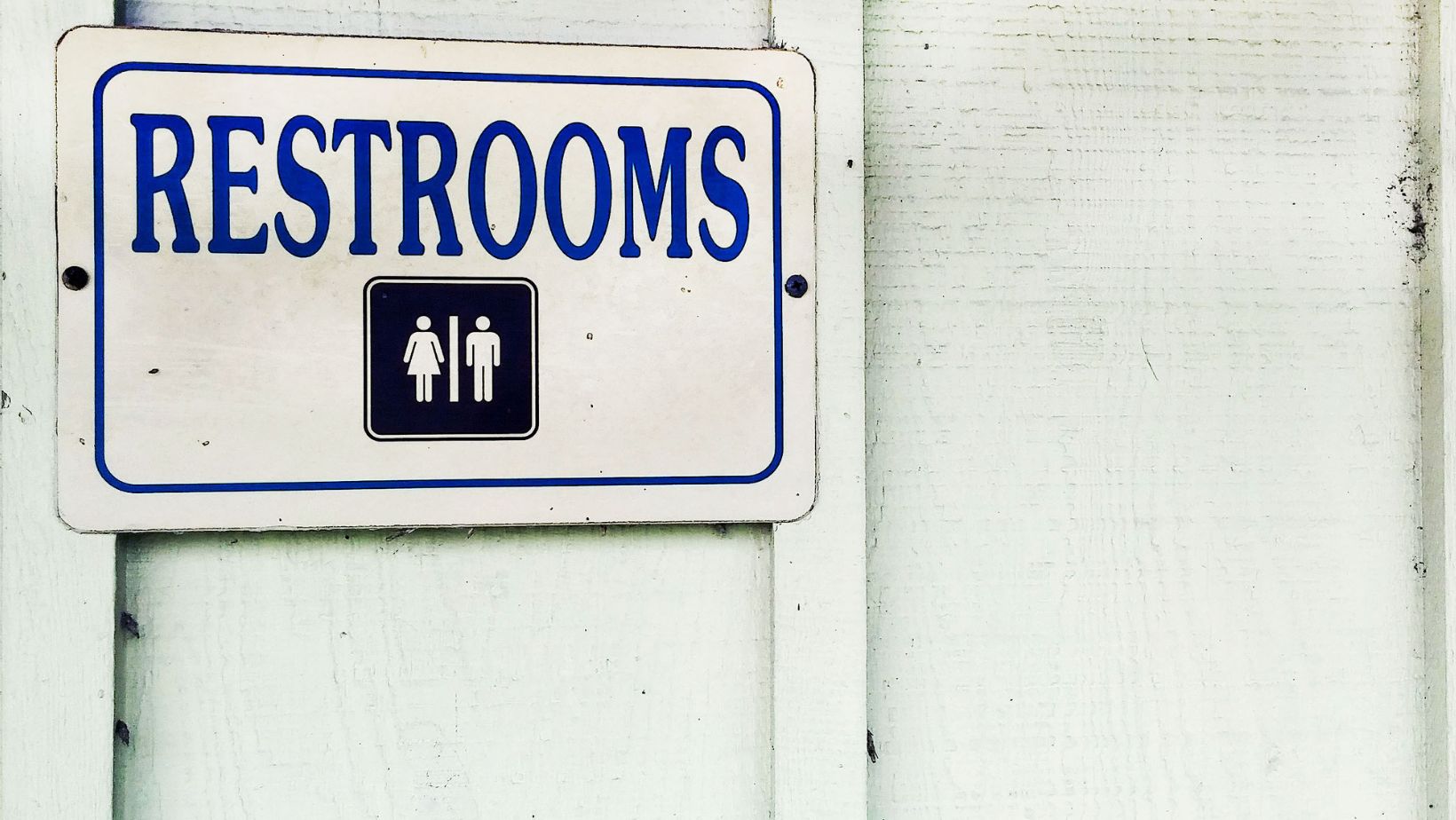
When it comes to public restrooms, we all know the basics: find the right door, get in and out as quickly as possible, and, ideally, avoid any awkward encounters. But behind those doors is a world of signage that plays a much bigger role than you might think. Enter the ADA restroom sign — an essential component of accessible design that ensures everyone, regardless of ability, can locate and use the facilities with ease. And while restroom signs might seem mundane, with a bit of creativity, they can be both functional and a bit fun.
What Are ADA Restroom Signs, Anyway?
ADA restroom signs which you can buy on Bsign store are specifically designed to comply with the Americans with Disabilities Act (ADA), which sets the standard for accessibility in public spaces. These signs aren’t just about following the rules — they are about making sure that everyone, whether they have visual impairments, mobility challenges, or any other disability, can navigate the world with confidence.
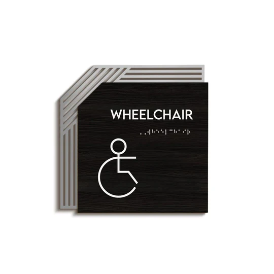
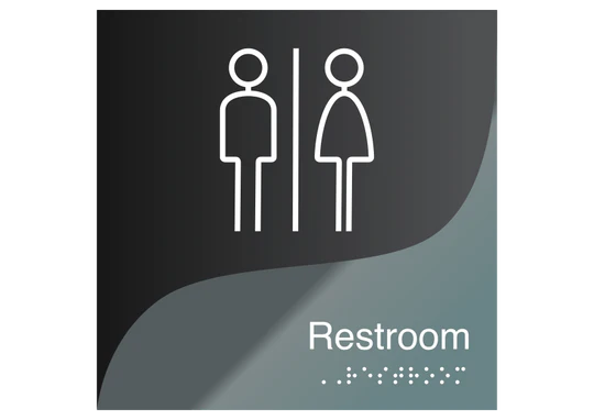
The key features of ADA restroom signs include Braille for the visually impaired, high-contrast colors for easy readability, and simple, universally recognized symbols (you know, the ones you can recognize even from the back of a crowd in a busy airport). These elements work together to create a sign that is both informative and accessible.
Why ADA Compliance is Non-Negotiable
Let us be clear: ADA compliance is not just a nice-to-have; it is a must-have. Failing to comply with ADA standards does not just mean a potential fine—it means leaving people out, and that is simply not cool. Imagine walking into a building and having no idea where the restroom is, or worse, finding the wrong one because the signs were not clear.

ADA restroom signs remove that uncertainty, ensuring that everyone, no matter their abilities, can find their way.
Plus, there is something deeply satisfying about knowing you are providing an inclusive environment. It is like offering a helping hand but in sign form.
Adding a Bit of Character
While ADA restroom signs must meet specific guidelines, there is no rule against adding a touch of character. Why stick to bland, boring signs when you can incorporate some fun into your design?
For instance, you could choose signs that fit the overall theme of your business or facility. A chic, modern restaurant might opt for sleek, minimalistic signs that match its decor, while a family-friendly venue could use playful colors or quirky fonts. And for those who really want to think outside the box, why not consider signs with a hint of humor? Picture this: a restroom sign that says, “Relax, you are almost there!” or “Nature is calling, and it is urgent.”
Of course, while humor can add a delightful touch, it is important to maintain clarity. The goal is to make sure the sign still serves its primary purpose—guiding people to the restroom—while also bringing a smile to their faces.
Wrapping It Up
ADA restroom signs might seem like a small detail in the grand scheme of interior design, but they play a vital role in creating inclusive, accessible spaces. And while compliance is non-negotiable, there is no reason you can not have a little fun with the design. So, the next time you are thinking about restroom signs, remember: it is not just about following the rules—it is about making everyone feel welcome, one sign at a time.


